View for Behance
Personal — 2014This documentation is a work in progress. Complete case study coming soon.
TEAM

MY ROLE
One man army - Responsible for Research, Interaction Design, UI Design, Motion Design, Prototyping, Development, Internationalization, Content Writing, Marketing
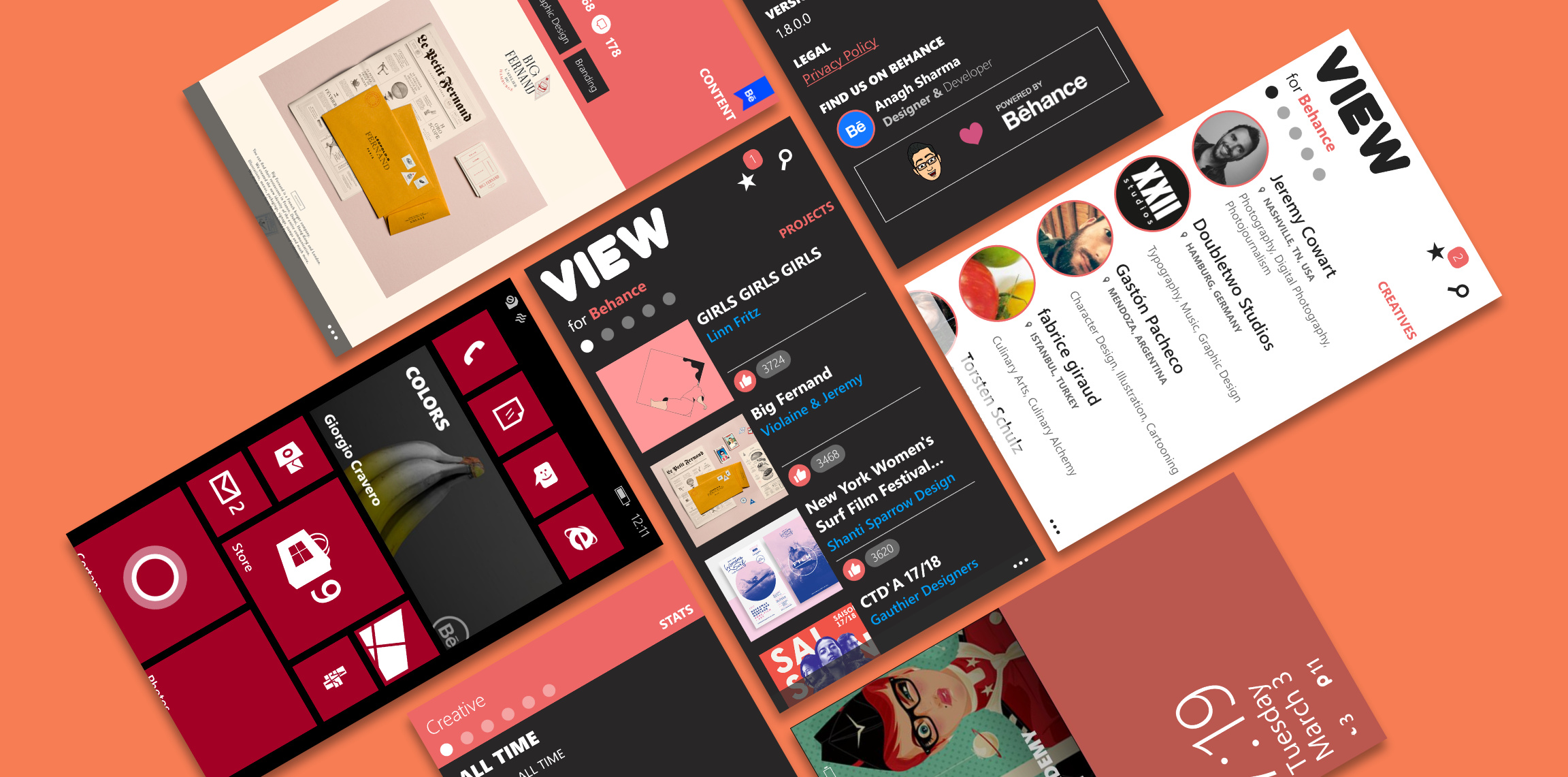
Designing a native client for Behance - providing an enriching and native Behance browsing experience on Windows Phone to fill the void of an official app.
In a hurry? Don't worry
Designed and built a native Behance client for Windows Phone from scratch to fill the official app void.
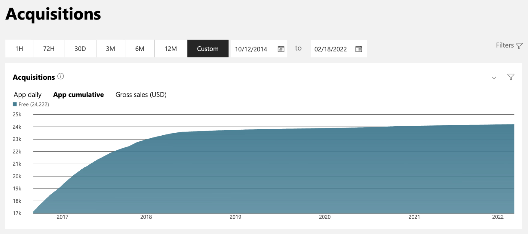
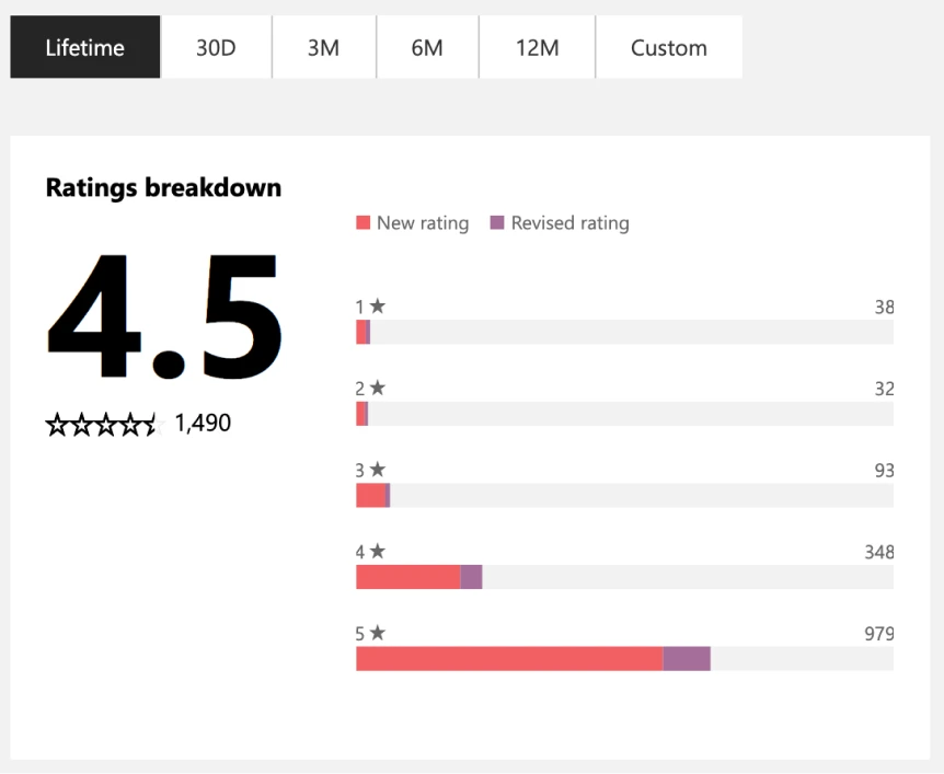
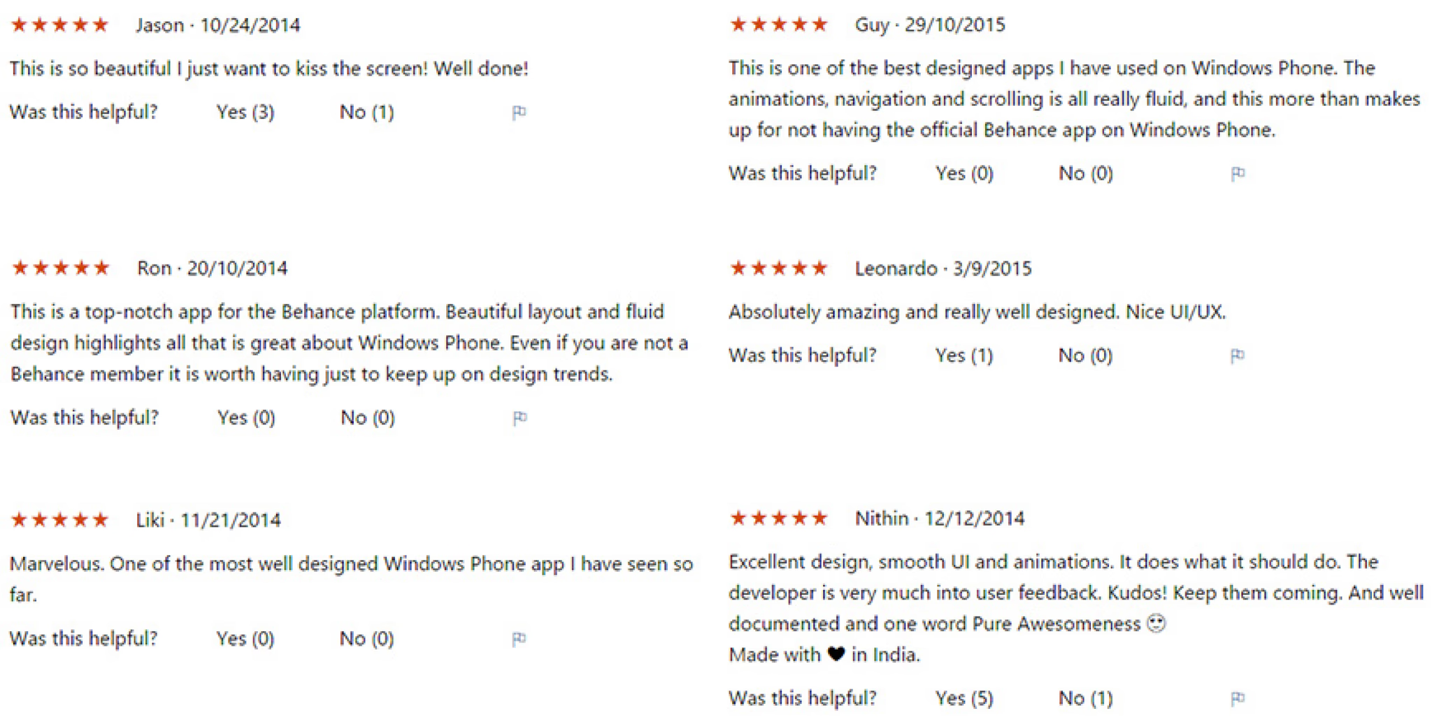
Featured on Microsoft, Nokia, Gizmodo, and WindowsCentral, with a 4.5-star rating from 1,500+ reviews.
Featured in the Windows Phone Store over 100 times across 100+ countries.
Managed the end-to-end lifecycle—from coding to six-language localization—directly launching my design career.
Context
Why did I start this project?
Back in 2014, while studying Computer Science in college, my friends and I were working on a startup. We spent our time hunting for creative inspiration, and Behance was our absolute go-to. But there was a catch: two of us were die-hard Windows Phone users.
SLOW & FRUSTRATING
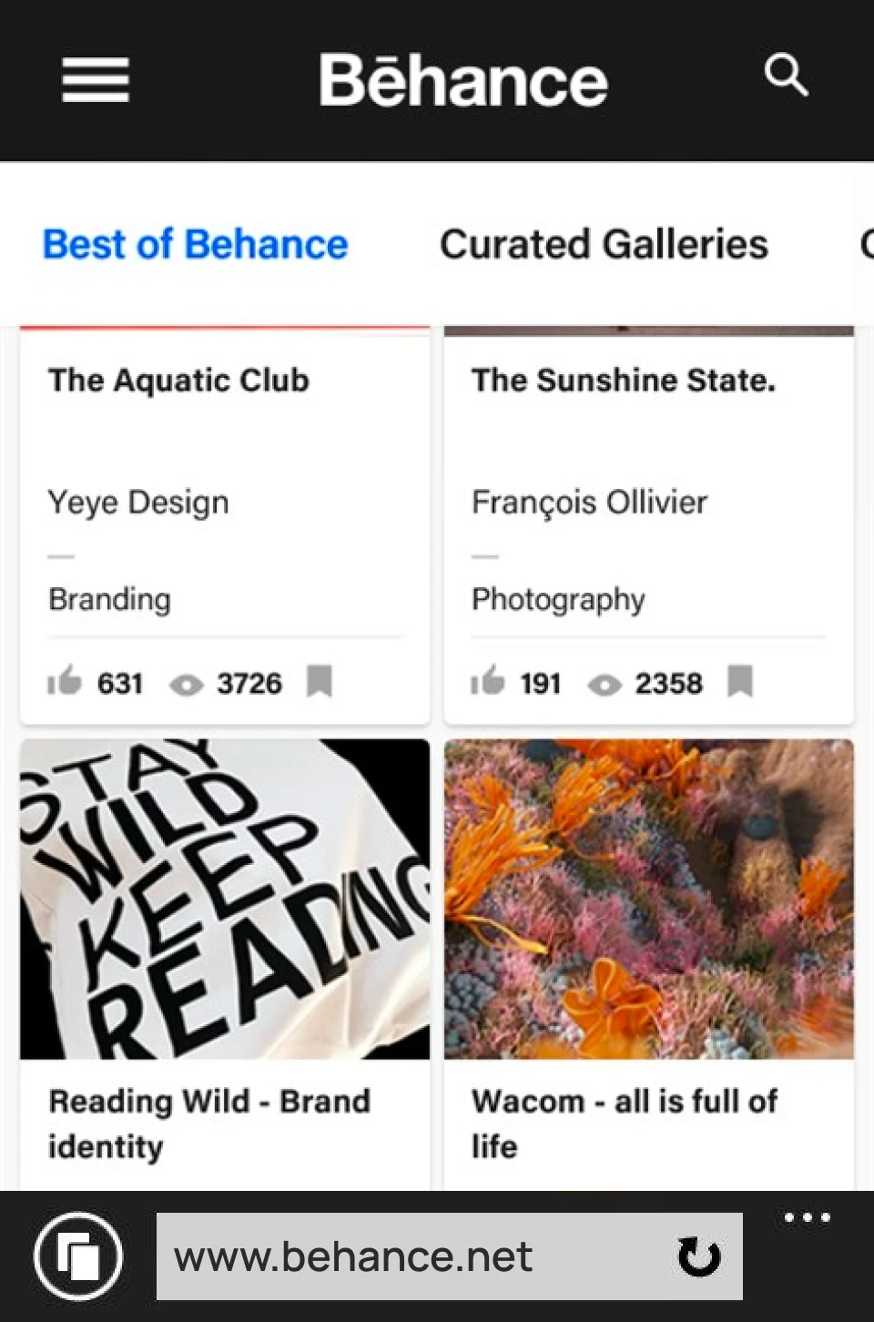
Browsing Behance on Internet Explorer was a laggy, unresponsive experience since there was no official app on the platform.
LACK OF ALTERNATIVES
A search in the Windows Store yielded no high-quality, third-party clients either. We were completely locked out.
I loved designing and building digital products. Instead of waiting around for an official release that would never come, I decided to take things into my own hands—not just for myself, but for the entire underserved Windows Phone designer community.
If I build this
...why would someone use it?
While other third-party Behance clients existed in the store, they were far from perfect. Before writing any code, I had to answer a fundamental question: Why would anyone choose my app?
To find my differentiator, I analyzed user reviews of competing apps to pinpoint their shortcomings:
TECHNICAL INSTABILITY
Most of the existing apps had severe technical issues, with users frequently complaining about the app crashing on startup or failing to load content.
LACK OF NATIVE POLISH
Some existing options felt like lazy web-wrappers that didn't respect the Metro Design Language.
ZERO VALUE-ADDS
They simply replicated basic search, without adding any features that made discovering design inspiration delightful.
I was looking to build a seamless, native Behance experience, but I didn't want to just add another brick in the wall. The app had to offer something unique. Based on these insights, I designed a series of value-added enhancements:
Shuffle
A discovery tool that surfaced completely random creative projects for inspiration.
Popular Fields
Quick-access to the popular categories of creative fields.
Quiky
A quick access hub to save inspirational works and creative profiles.
Structuring
... the inspiration
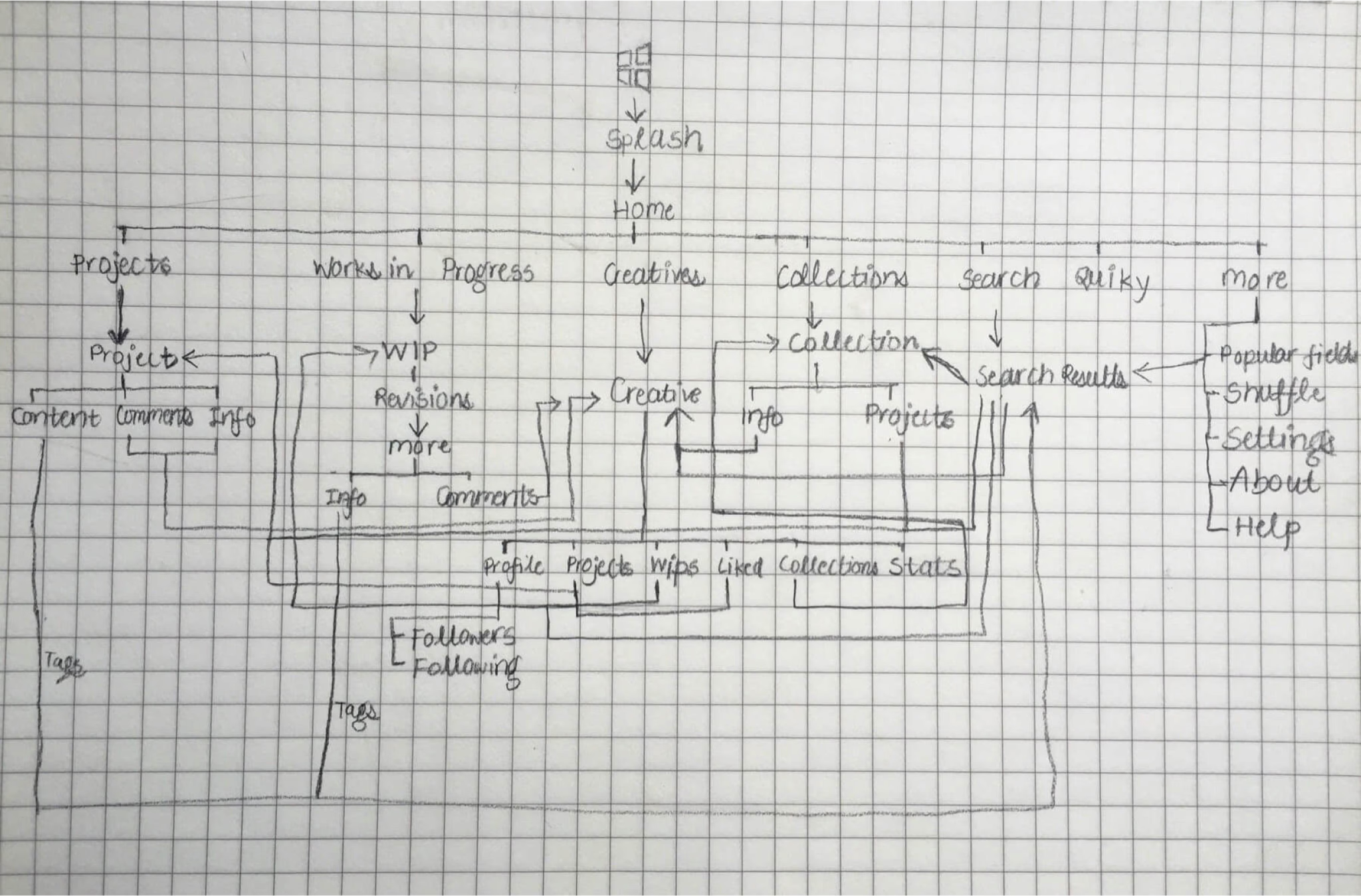
The app needed to surface the core content of Behance without overwhelming the user on small-screen mobile devices. I structured the navigation around the classic Windows Phone pivot layout with a touch of my customization -
Projects
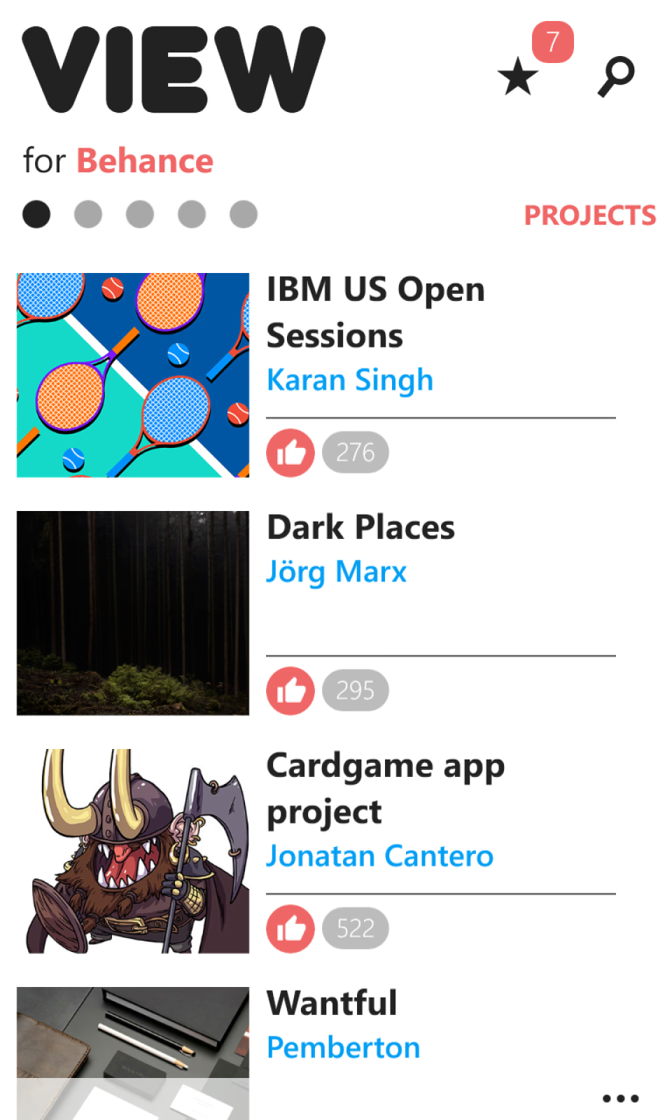
Explore the featured projects, featuring rich media, meta infromation, and user appreciations.
Works in Progress
Follow the featured works-in-progress, and subsequent revisions of creatives.
Creatives
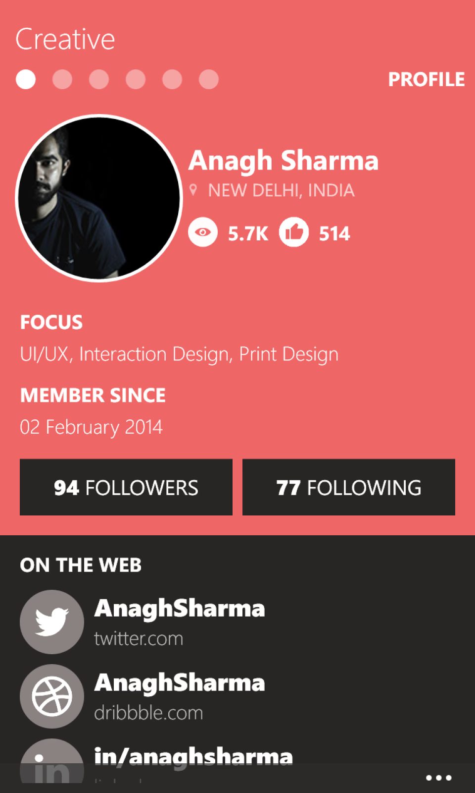
Connect with creatives around the world.
Collections
Browse curated groupings of projects organized around specific theme.
Search
Query the entire Behance database and filter search results by popularity, creative fields, or timeline.
Quiky
A quick access hub to save inspirational works and creative profiles.
More
Explore sub-options including popular creative fields, the shuffle tool, and the about section.
Instead of sketching
...I prototyped directly in code
I didn't spend days sketching layouts on paper. Thanks to my proficiency in Visual Studio Code, I could spin up a working prototype in a single night by hooking it directly into the official Behance API.
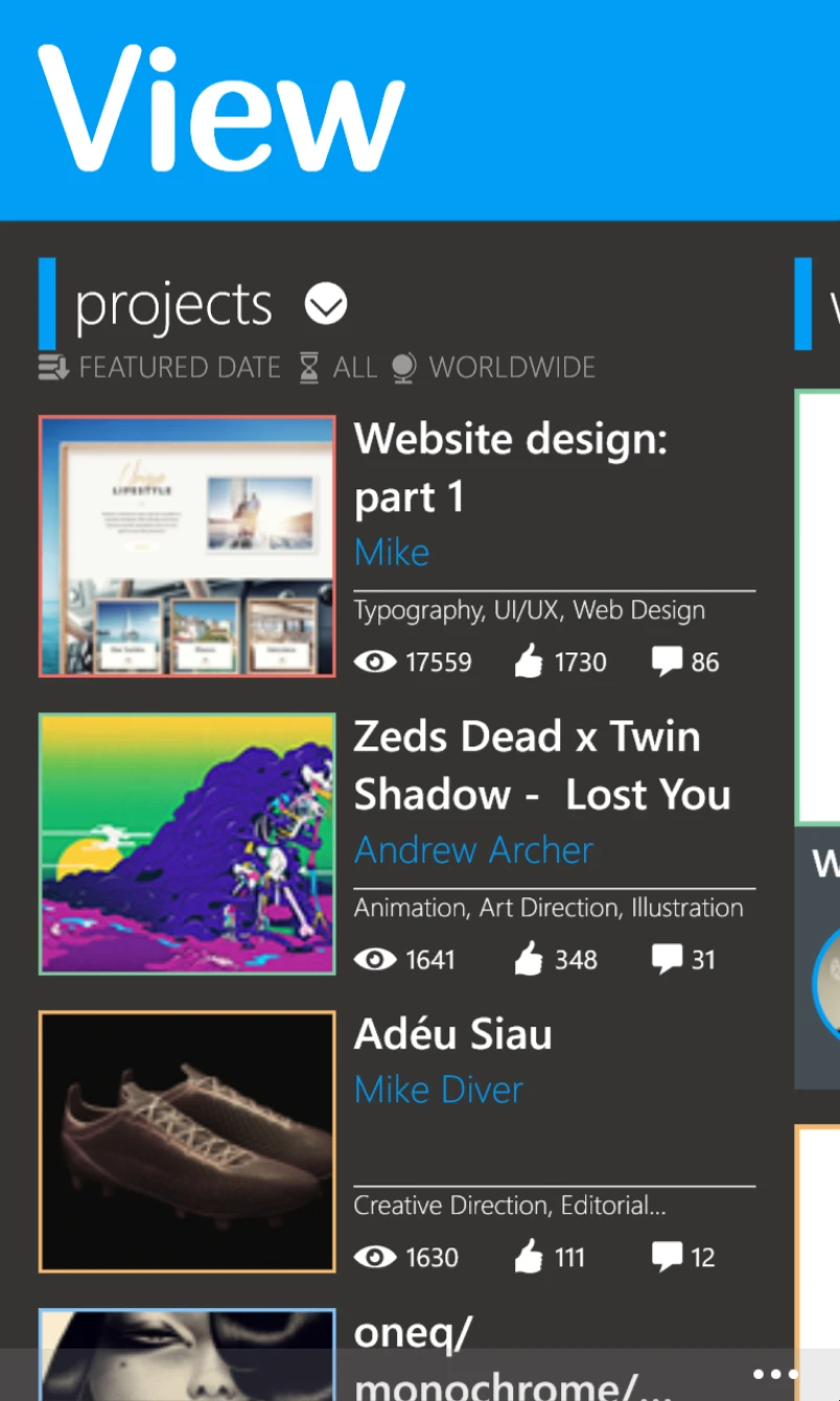
Designing directly with live API data allowed me to test layout decisions in real time. These three screens capture the exact progression of my UI experiments, showing how I transitioned from information overload to a clean, minimalist design.
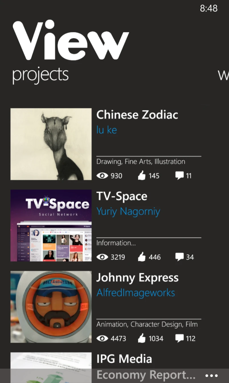
The Final One
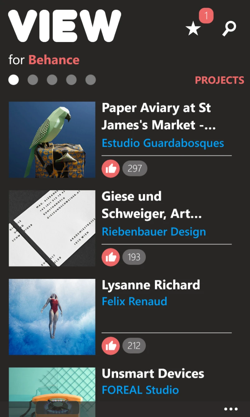
Visual design
...was built to let artwork speak
Since competing clients displayed the exact same Behance API data, I knew that the visual design would be my ultimate differentiator:
THE KEY DIFFERENTIATOR
Strongly felt that the visual design would be the key differentiator from competition since the rest of the content would almost be the same.
DO MORE WITH LESS
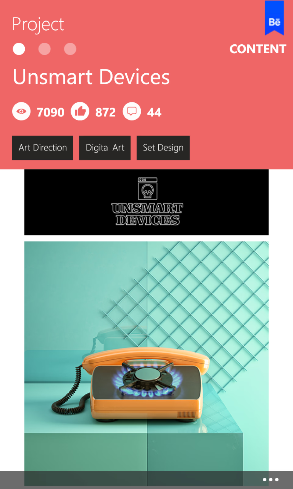
Followed the "Do more with less" principle of the Metro Design Language (MDL).
REDUCED CHROME
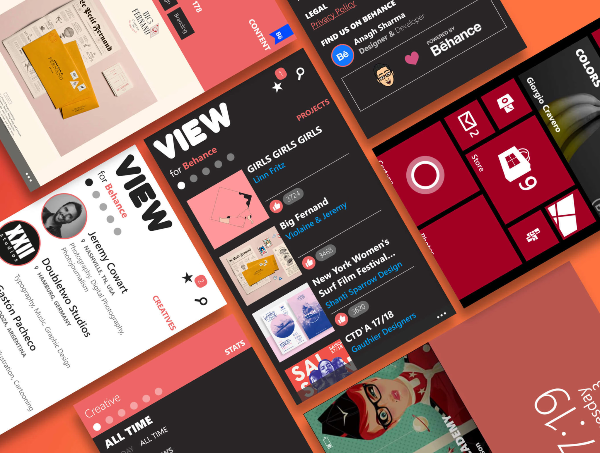
Reduced chrome to a great extent, stripping away unnecessary UI elements.
CONTENT-IMMERSIVE
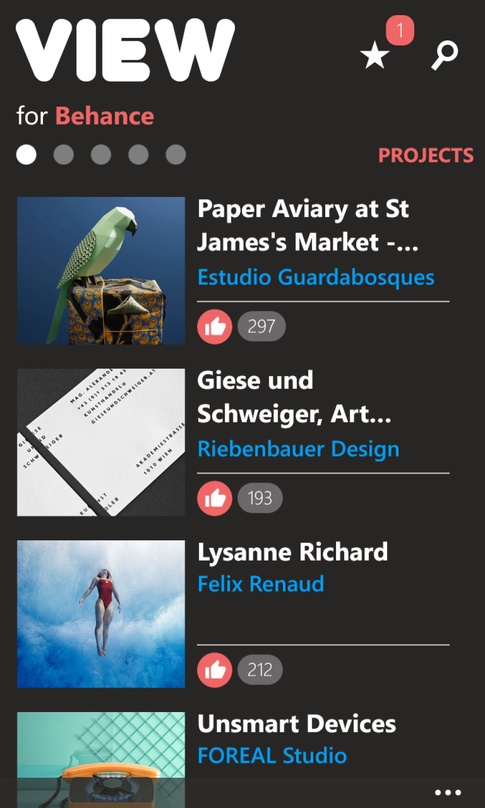
Right after users launch the app, they get immersed in the content which consists of large thumbnails letting the content speak for itself.
Search
...built to eliminate page hopping
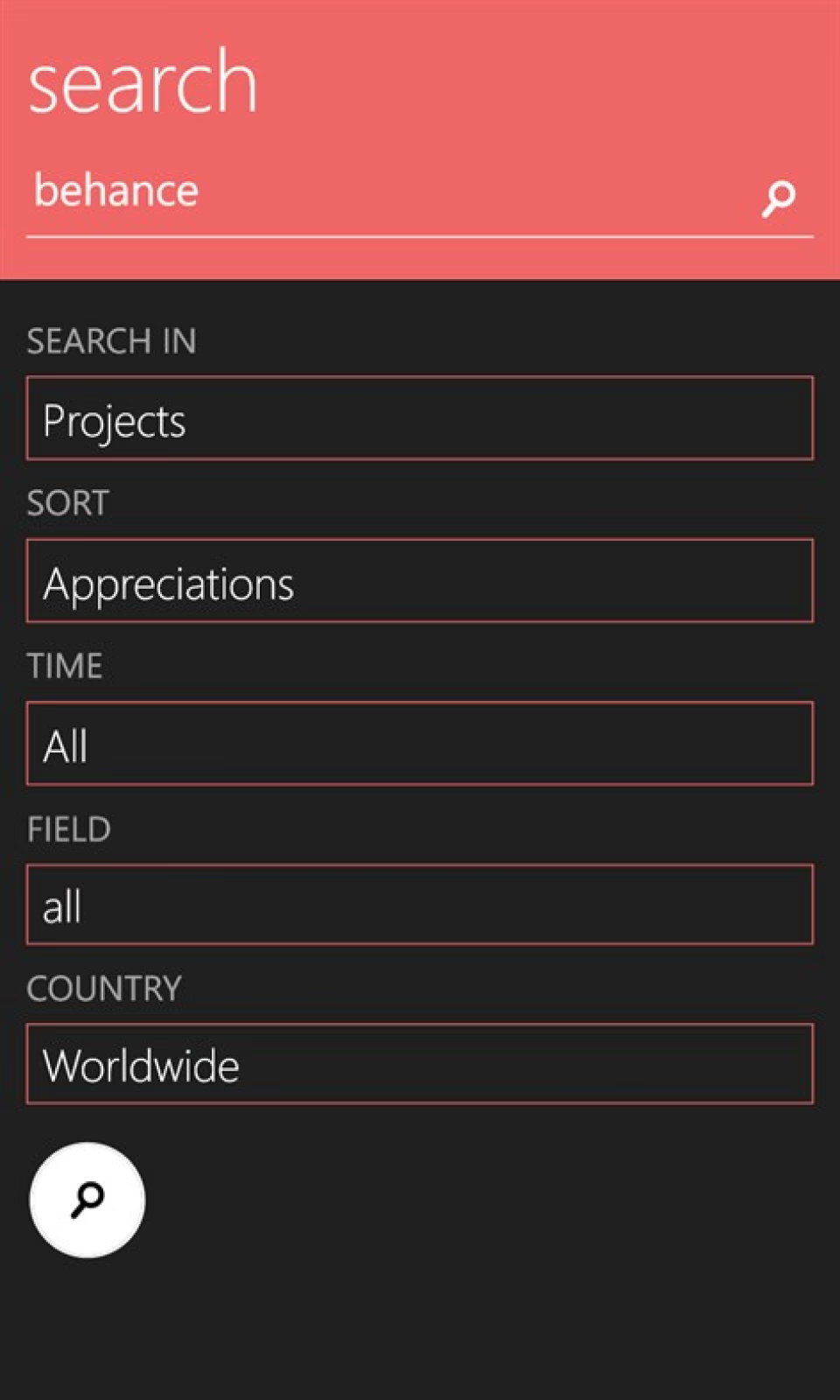
Searching was a core focus of the app, but presence of filters created a major challenge: how to prevent constant page-jumping.
AVOIDING BACK-AND-FORTH
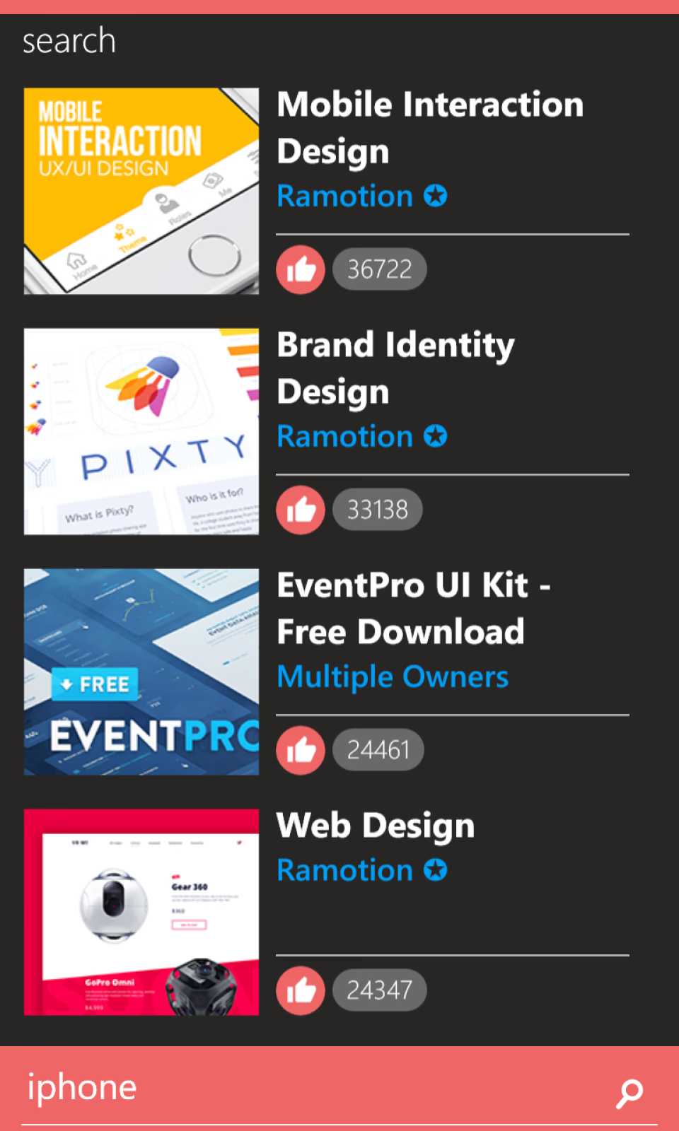
Designed the experience to allow quick toggles without forcing users to navigate back and forth between dedicated pages.
THE SPACE CONSTRAINT
If active search filters were permanently visible, they would consume valuable screen space, leaving less room for project results.
CURTAIN INTERACTION
Implemented a sliding, curtain-like interface that drops down dynamically to reveal search results.
Localization
...to make the app globally accessible
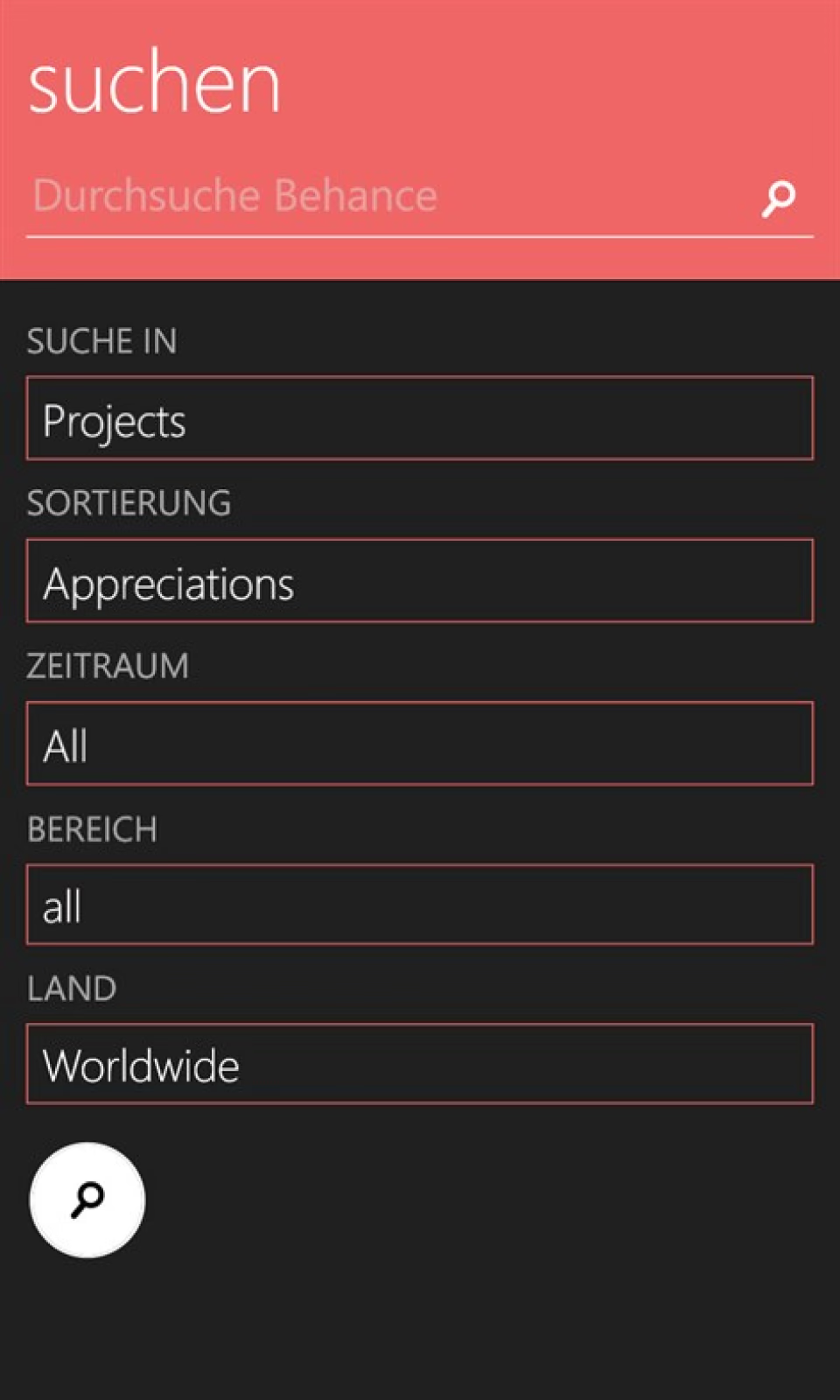
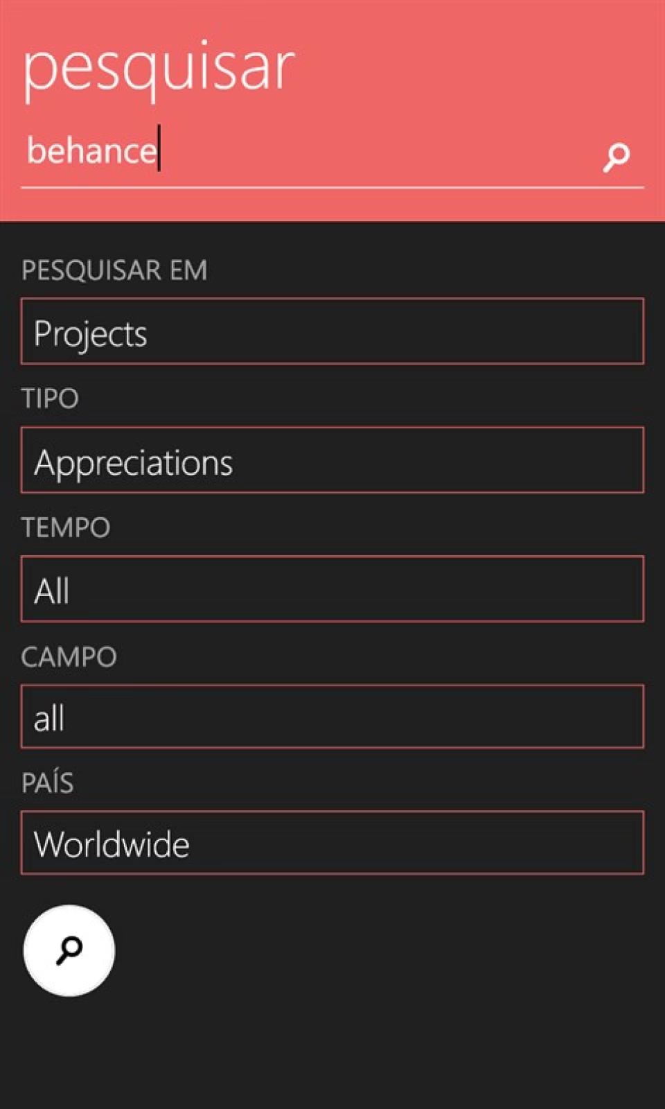
In order to make the app more accessible to local markets, I enabled localization inside the app and supported six languages at launch:
English
Portuguese
Polish
Indonesian
German
Romanian
Adapting the UI layout to handle translations was a challenge. Languages like German often had much longer words that would break native layouts if not budgeted for dynamically. I resolved this by utilizing flexible layouts and adaptive text wrapping.
Challenges
...and overcoming them
Midway through the project, Adobe pulled native login support from the official Behance API. Without login, users couldn't save or bookmark inspiration: I had to find a creative workaround to keep the app useful.
THE SOLUTION: QUIKY
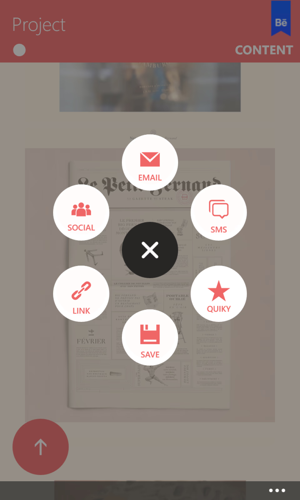
Developed 'Quiky'—a feature that let users save projects, works in progress and creatives for later use.
Impact
Overwhelming response and career launchpad
When I launched the app, the feedback from users and the community was incredible. It filled a major gap in the ecosystem and became a showcase of native Windows Phone app design -
Media features
The app got featured on major tech publications, including Microsoft, Windows, Nokia, Gizmodo, WindowsCentral, and others.
App Store Features
It was featured in the Windows Phone store more than 100 times in more than 100 countries.
Career Catalyst
Publishing the project on Behance got me noticed by recruiters, leading to an opportunity at Snapdeal, launching my design career.
Happy Users
One of the users was so impressed that they created a new icon and promotional video for the app.
Takeaways
...from running a one-man product cycle
This project taught me how to manage a complete product cycle: research, design, coding, localization, marketing, and user support. It proved that deep empathy for platform conventions and a dedication to detail can make a massive impact on users worldwide.
In some areas, I over-customized the interface. While most users appreciated the unique style, the custom page layouts and non-standard navigation ended up confusing a few. This wasn't intentional—it was simply a constraint of my limited technical experience at the time.
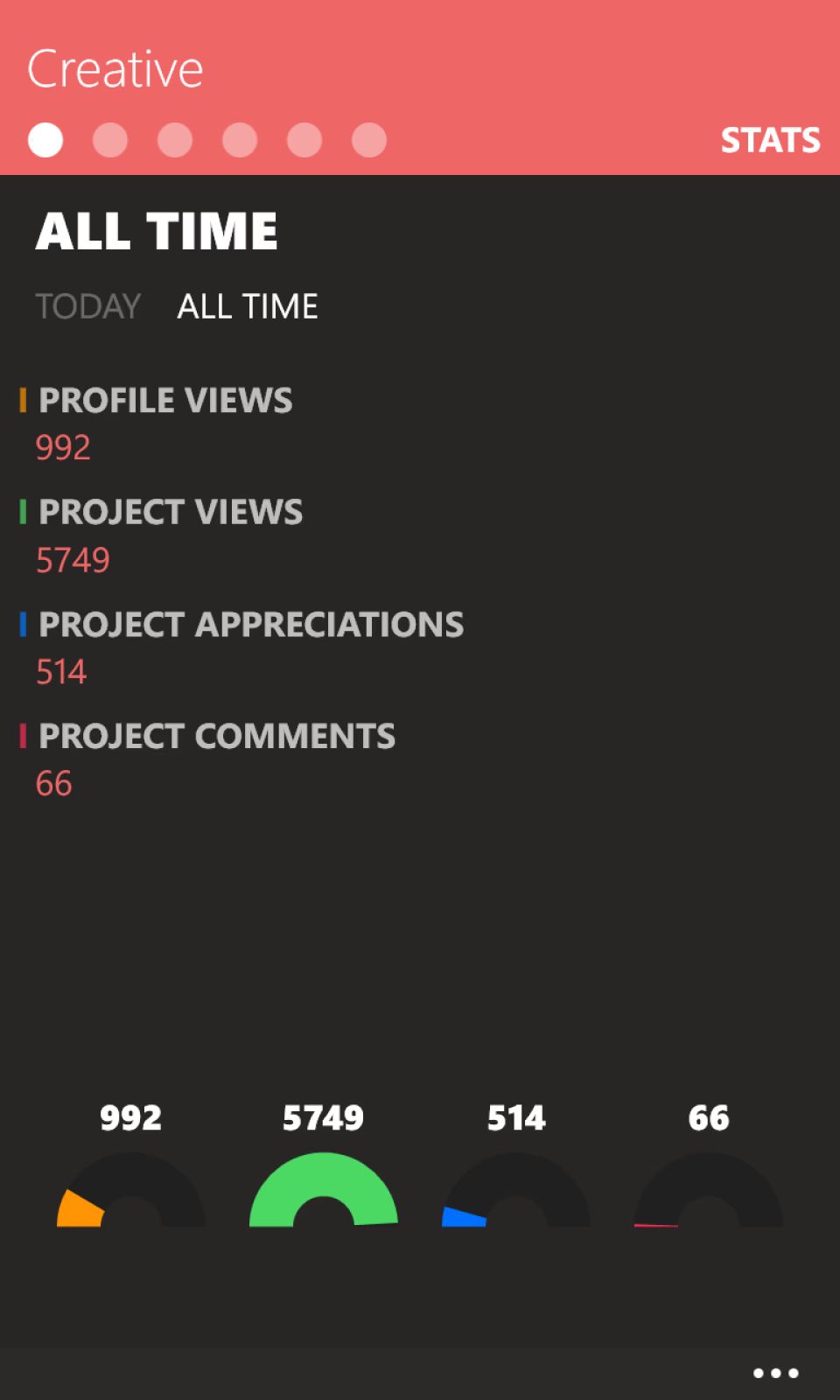
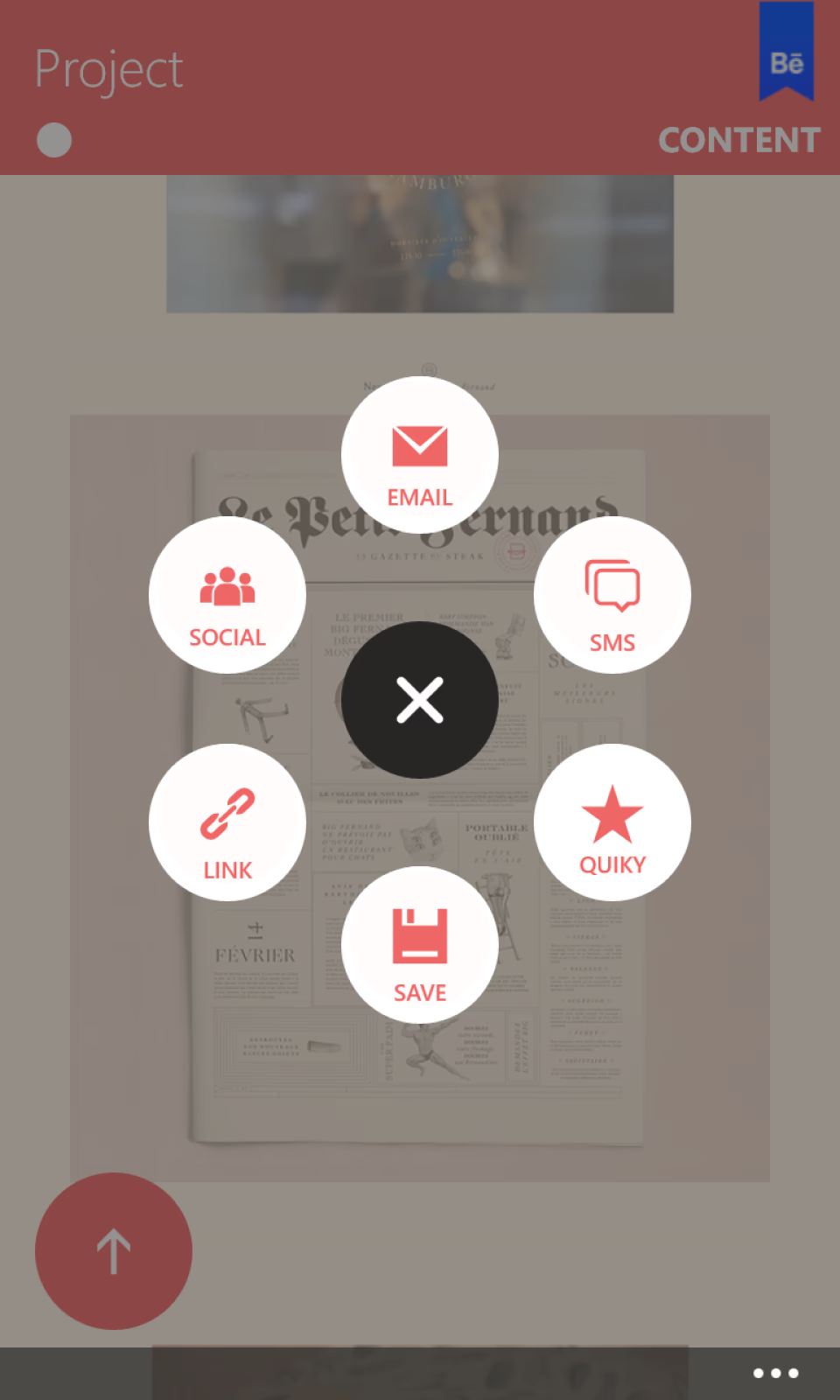
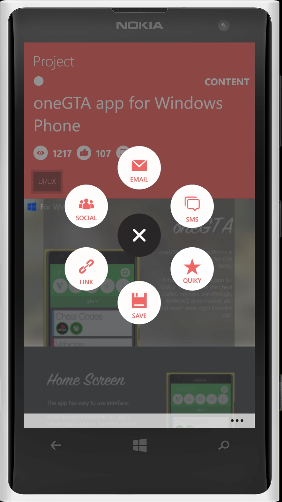
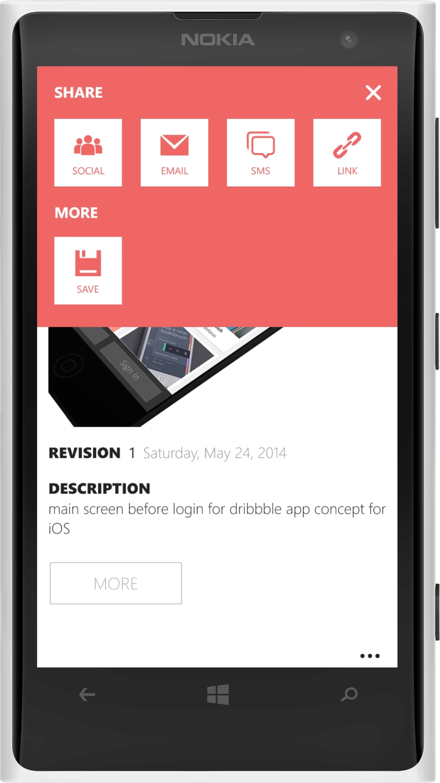
I also designed 2 different types of sharing menu for tap and hold interaction, one for projects and one for works in progress.
Contents
In a hurry? Don't worry
Designed and built a native Behance client for Windows Phone from scratch to fill the official app void.
Featured on Microsoft, Nokia, Gizmodo, and WindowsCentral, with a 4.5-star rating from 1,500+ reviews.
Featured in the Windows Phone Store over 100 times across 100+ countries.
Managed the end-to-end lifecycle—from coding to six-language localization—directly launching my design career.