Masala Design System
Long before the design system, we already had a color palette with a few colors named after spices.
Hence, the name.
This documentation is a work in progress.
TEAM

MY ROLE
Lead Designer - Responsible for Strategy & Execution, Research, Interaction Design, UI Design, Usability Testing, Accessibility Adherence, Content Writing, Documentation Framework
Architecting a design system - the backbone of a wide spectrum of products - meeting the needs of 100s of users, designers & developers.
In a hurry? Don't worry
Lead Designer - responsible for building the system from scratch.
Typical process involved - auditing existing products, interviewing users, competitive research, usability testing, etc.
Established the documentation framework.
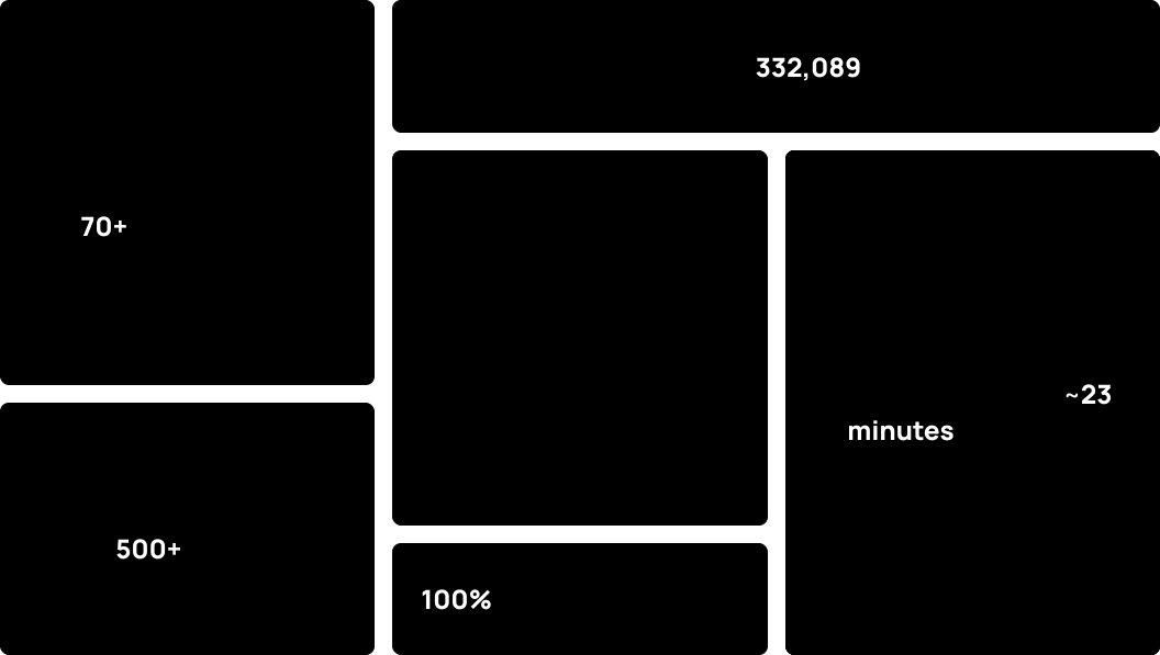
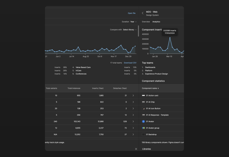
Peak usage of 332,089 instances in a week in Figma.
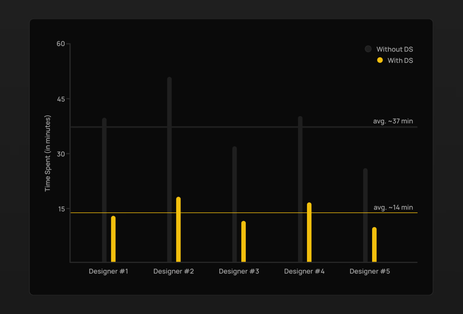
For a screen with a table, avg. time saving* of ~23 min.
Context

Building a design system is a journey, and not a destination. It is not easy to put the countless hours spent over the years in a single case study. What I have tried here is to explain the overall general process that I followed along the way.
Excuse me, why do we need a design system?
For years, the designers and developers at Innovaccer were building the same things again and again from scratch for different projects which resulted in —
Inconsistencies
Key reason for low user satisfaction and frustration.
Lack of Reusability
Wasting time = Wasting money.
No Support For Accessibility
Which eventually led to more usability issues and frustration.
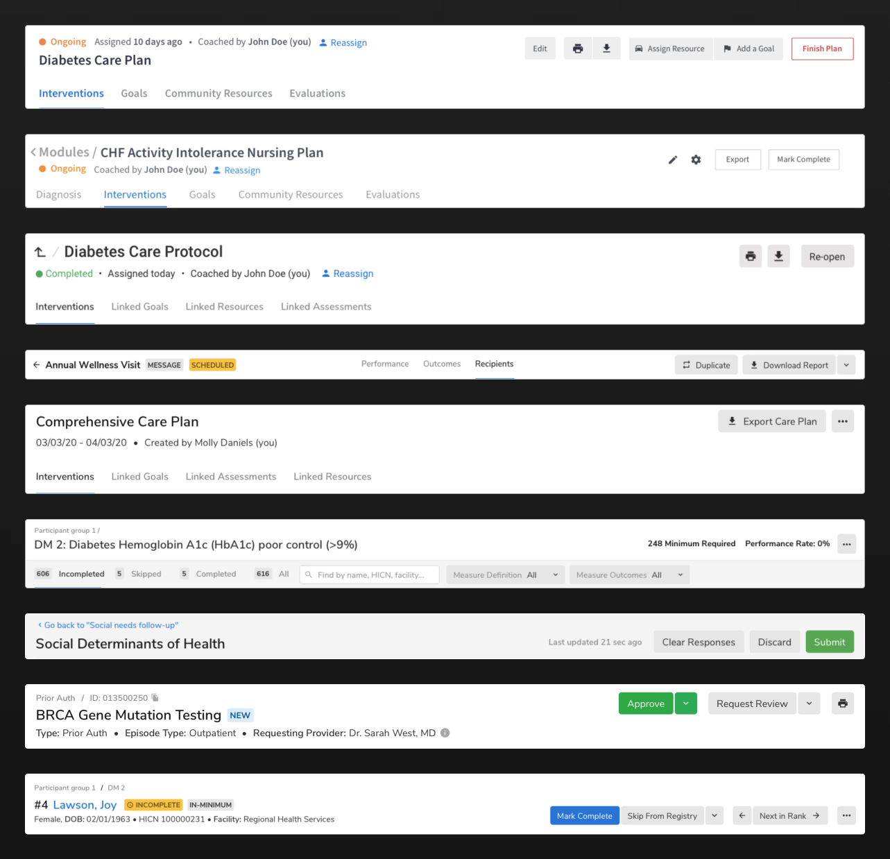
Small steps...
We did not have a dedicated design system team. Hence, the designers took the initiative to at least have a UI kit at the design side to save time and consequently have consistency.
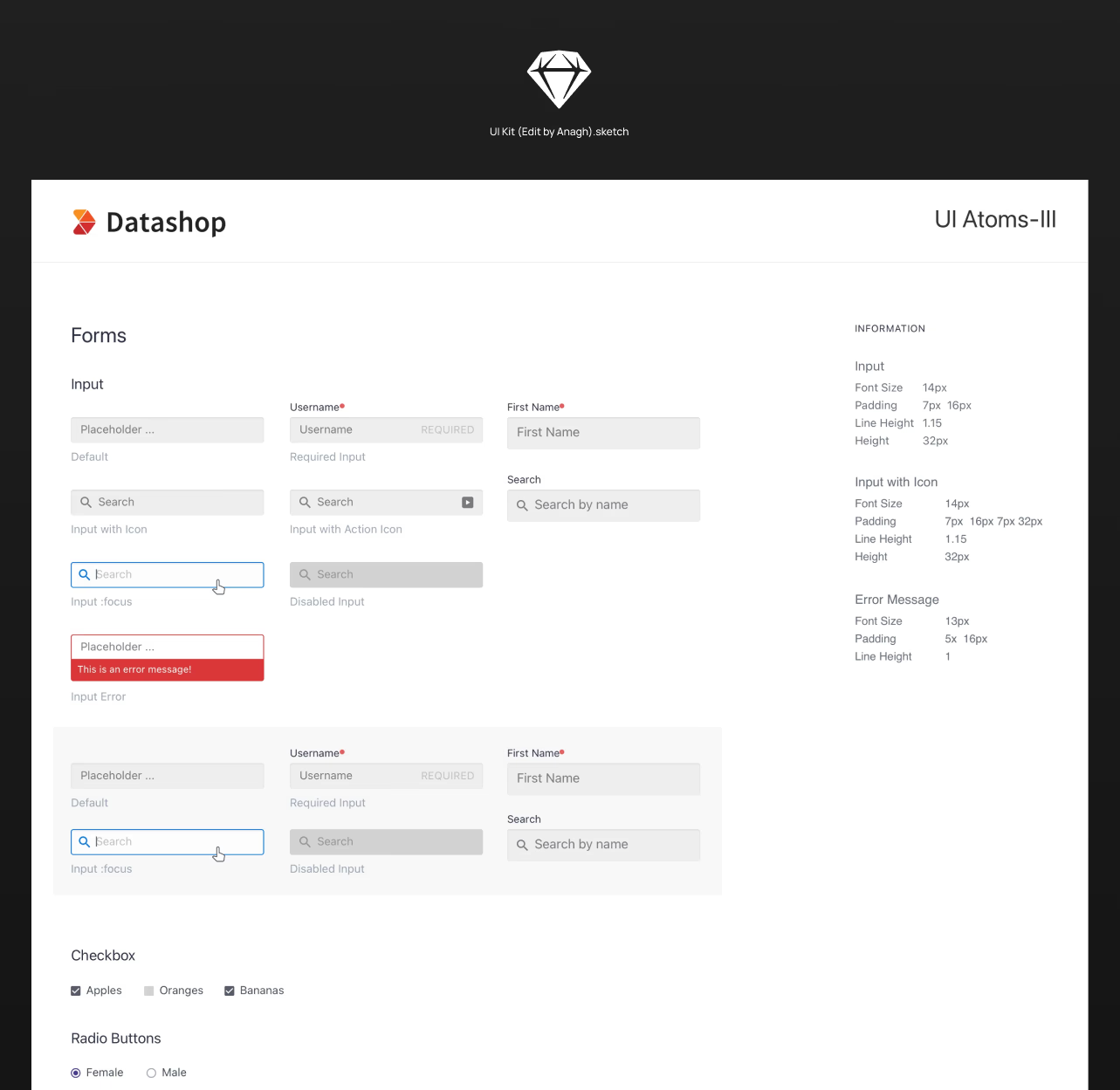
...for big changes
With the help of the UI kit, designers were able to design sales demo at a fast pace.
Benefits of a simple UI kit — the org was growing, and realizing the benefits of the UI kit, the leadership agreed for a dedicated design system team.
Foundation
Hold on, take a deep breath first
Before going all in, the team had a few concerns —
Adopting another system?
Our products rely heavily on tables which no other system had nailed completely. I insisted for having our own system which also meant greater flexibility in general.
Start from scratch?
We already had a base on the design side, hence I insisted on continuing from there.
Restrictive or Flexibile?
We decided to keep it a bit open for more flexibility and came up with our guiding principle of — "Simple should be easy and complex should be possible."
Merge product & brand design?
Our customers and users are different, hence we opted to not do it.
Home for the Guidelines?
I had earlier proposed that we should have our own website. But it meant additional overhead, hence we went ahead with Zeroheight for its simplicity.
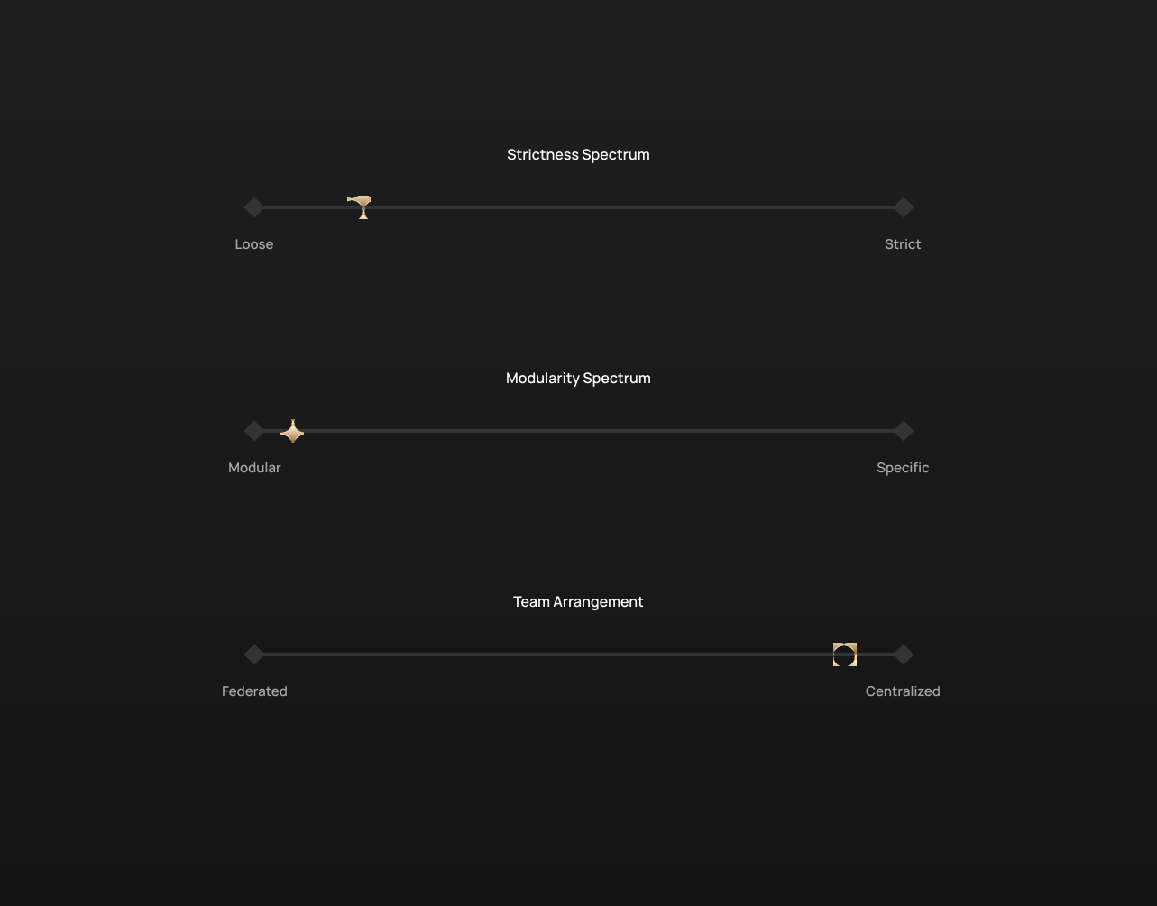
Lead me, guide me, walk beside me
This foundation helped set our very own torchbearer, our guiding principle which helped me in times of ambiguity.
Simple should be easy and complex should be possible.
One stone, two birds
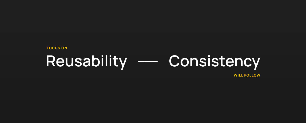
My mantra for the design system started taking shape — focus on reusability, consistency will follow.
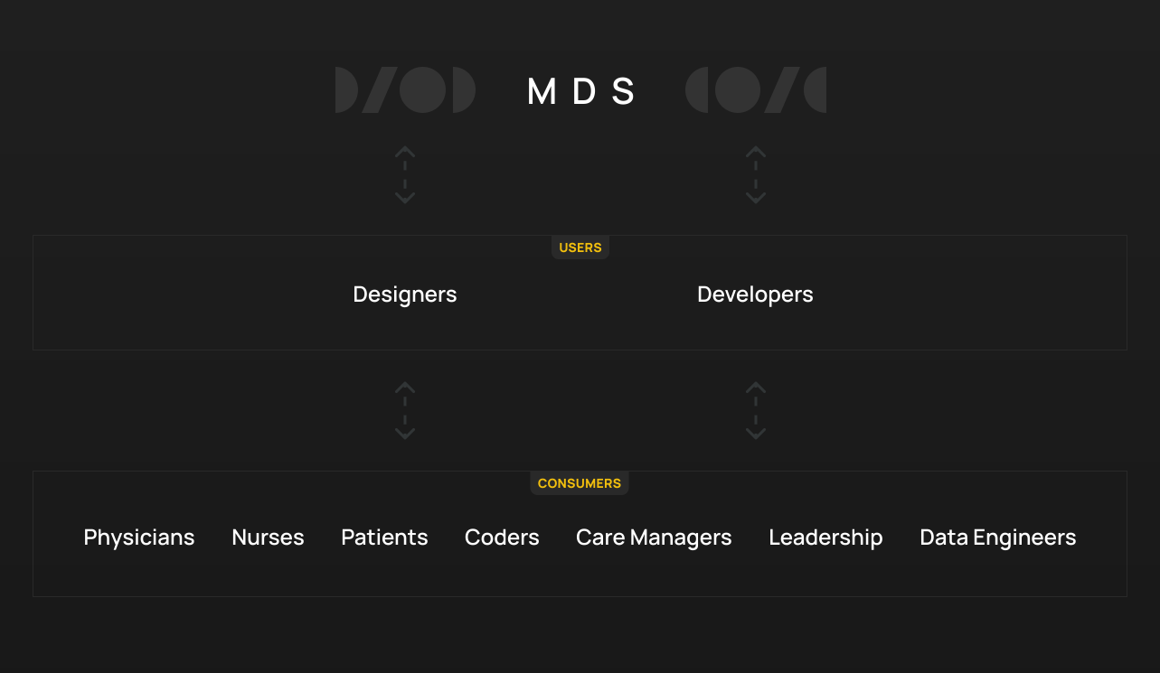
Users...
...and the consumers
Designers and developers use the Masala Design System to create products for the consumers — physicians, nurses, care managers, coders, data engineers, etc. The feedback from these products then flows back to guide the design system.
Setting up...
...the lab
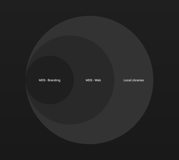
I. Libraries structure
MDS - Branding remains at the core containing the tokens such as colors, etc. MDS - Web inherits from MDS - Branding to create components and patterns. Any other library local to a product or domain should inherit from MDS - Web to create components specific to them only.
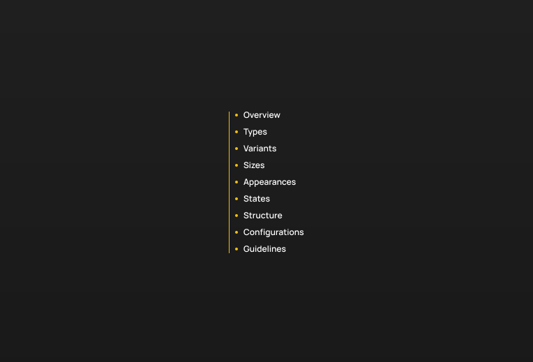
II. Structure of a component
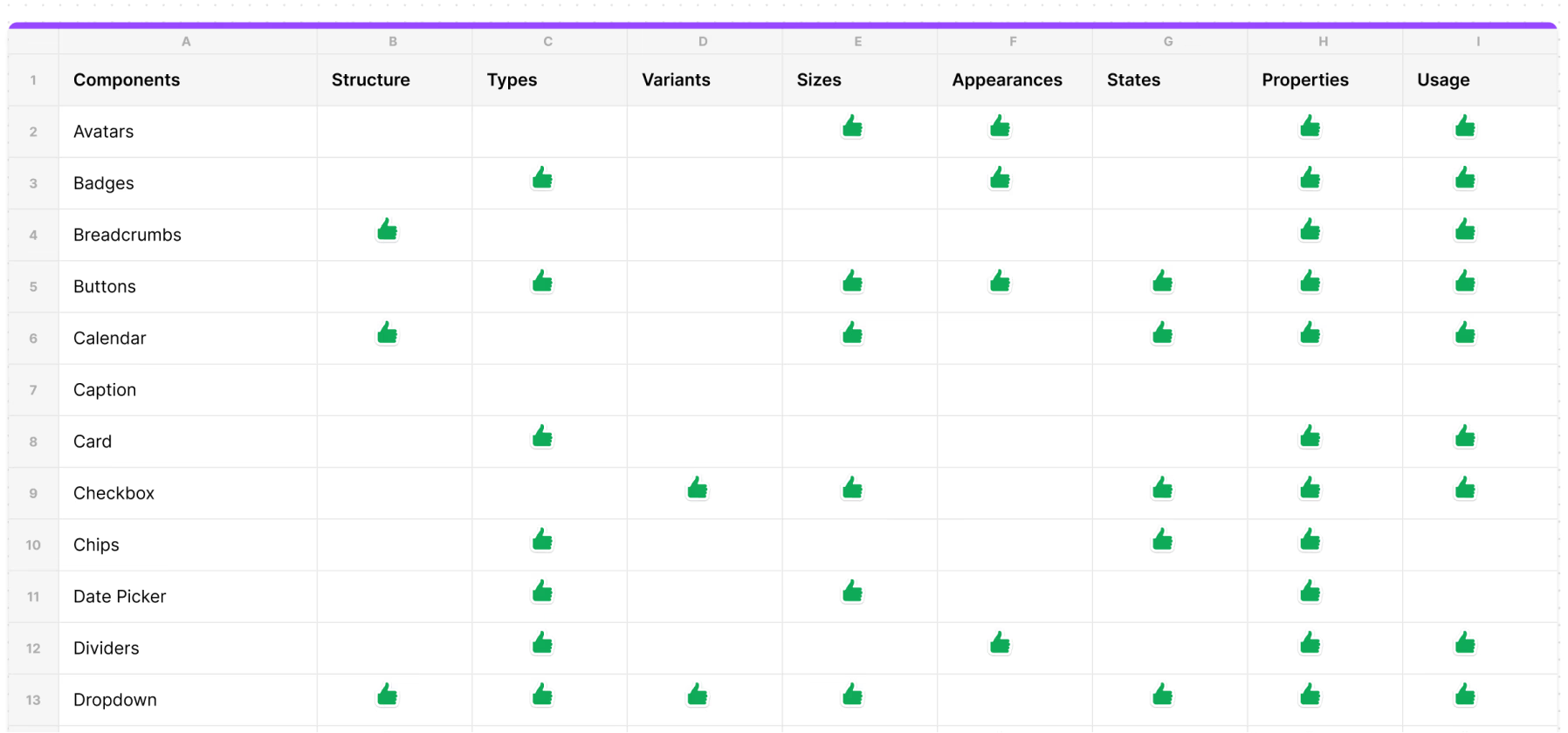
An exhaustive list of what a component could contain was defined initially and iterated over time. The challenge here was to have a clear distinction between the categories such as Types and Variants.
Started from the bottom...
...with the atomic design approach
I. Colors
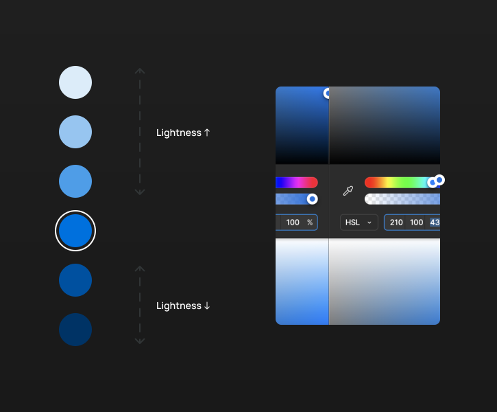
I first started with generating a brand new color palette from a set of colors that we already had. The idea was to create a consistent and accessible color palette. I used the HSL color model to ensure different shades of the same color could be easily created by just adjusting the Lightness factor while Hue remains the same.
The palette was generated by testing the contrast ratio as per WCAG 2.2 guidelines.
II. State Logic
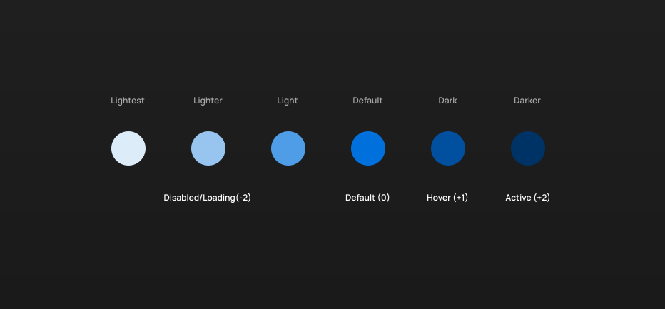
Once the colors were finalized, the need of the hour was to create a state logic so that the same state i.e. hover, etc. of different components ideally look and behave the same.
This logic worked for most of the components. Exceptions were made where it did not work.
III. Grid
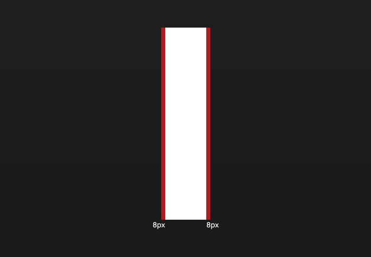
Majority of our products are web based and demand responsiveness. We decided to go ahead with the industry standard 12 columns grid. Although instead of a single 16px gutter, we made 8px of gutter on both sides, part of the column itself.
Figuring out what to build first
Audit a.k.a. Interface inventory
One time process of auditing and evaluating the products our users are building.
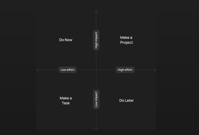
Basis on the frequency, list the components down in descending order.
Sit with the entire team to do the impact effort matrix exercise.
Interviewing the users
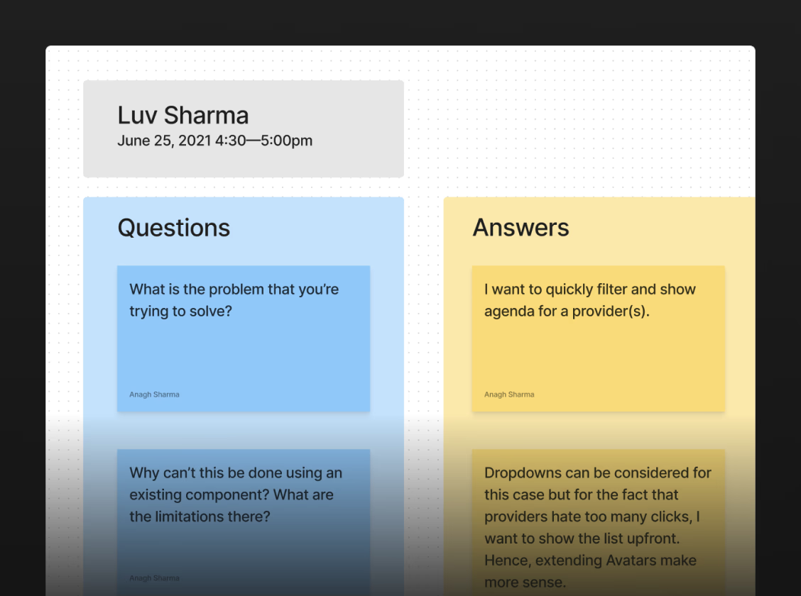
If the component is being requested from a user i.e. a designer, then I would talk to them about what their expectations are and ask questions like -
Why do they need a new component or pattern?
Can we anticipate it being used somewhere else? Can we validate this by looking at other products?
Should this even be a component or should this be a custom solution for your case? etc.
How I built things...
...more or less with a single iterative approach
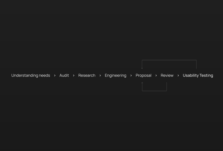
I followed and improved on the iterative method to design components and patterns as shown below —
I. Understanding needs
Before building anything, my job usually started with understanding the need of building a new component or pattern, answering fundamental questions such as following, through interviewing the designers -
Why does a designer need a new component or pattern?
Should this even be a component or should this be a custom solution for your case?
Can we anticipate it being used somewhere else? etc.
II. Auditing the existing products
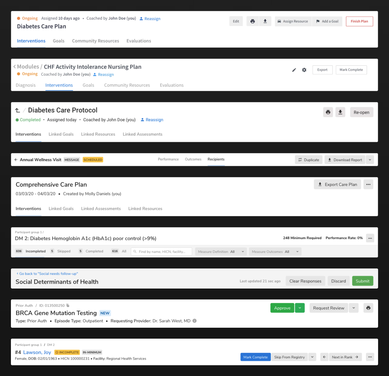
The process of building a component as simple as a button or as complex as a table started with the design evaluation of existing products which included —
Go through our products to find out where it or something like it is being used already.
Take the relevant screenshots and paste them in a Miro (later FigJam) board.
Rearrange and segment the screenshots if needed.
Identify the patterns.
III. Research
I largely followed three broader methods of desk research -
Public design system documentations.
The purpose of exploring other design systems was to see if they already have a similar component or pattern and what are the usage guidelines around it. I typically referred to -
- Material Design
- Carbon Design System
- Lightning Design System
- Polaris Design System
- Atlassian Design
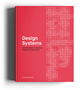
Referring the book - Design Systems by Alla Kholmotova
Design Systems by Alla Kholmotova came quite handy by providing valuable and insightful guidance for the different stages of Masala Design System.
Referring Nielsen Norman Group website - nngroup.com
There are a lot of great articles on nngroup.com which helped me in taking decisions fairly easily and mentioning the same in our documentation — because sometimes designers will come to you to get an explanation of why a component/pattern behaves in a certain way.
IV. Proposal
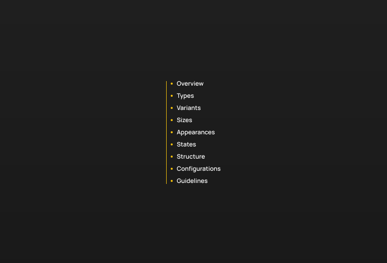
Once all the research would be done, I would then create a detailed proposal draft of the desired component which includes (wherever applicable) -
Overview
Types
Variants
Sizes
Appearance
States
Properties
Configurations
Usage guidelines, which also include the 'Why' behind the design decisions.
V. Accessibility
I wanted to prioritize accessibility from the outset and adhered to the contrast ratio guidelines while creating the color palette as well. While covering the entire spectrum of WCAG 2.2 guidelines was essential, due to time constraints, I focused on just three of them —
Text alternative - providing a text alternative for non-text content e.g. for icon buttons.
Distinguishable - sufficient contrast ratio.
Keyboard accessible - navigating using a keyboard and having clear focus states.
VI. Usability Testing
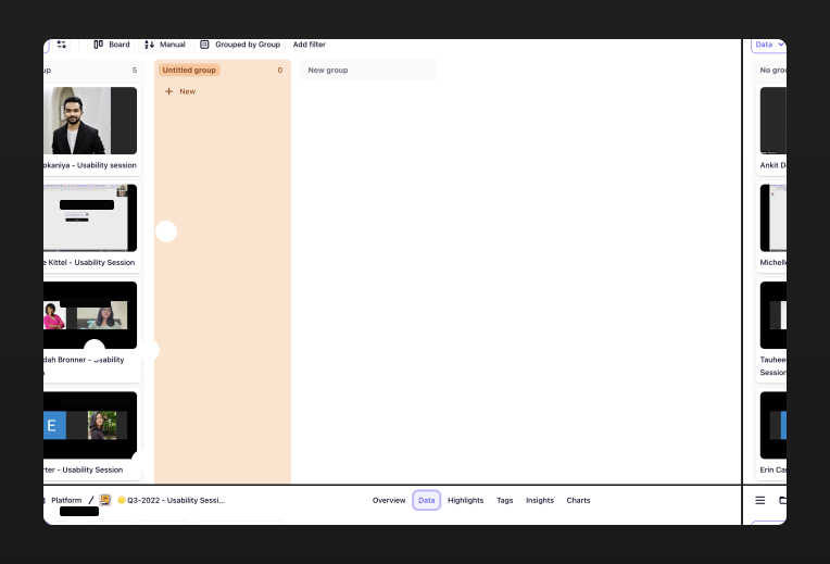
For complex patterns, I would conduct usability testing sessions too e.g. for applying filters in a table.
Release
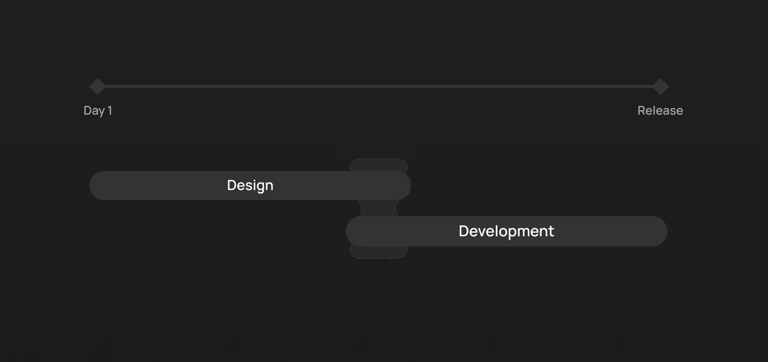
A component only gets released once it is readily available to use for both the designers and the developers.
Impact
I. Reduced building time
I ran a controlled experiment where for a simple screen with a table, designers saved approximately 23 minutes with design system usage.
II. Adoption
Our design team is > 30 now and using the design system everyday. These inserts numbers are huge and tell a lot about the adoption.
Challenges...
...and overcoming them
DS developers not knowing what is configurable and what is not - I started adding 'Configurations' table in the documentation to overcome this challenge.
DS designers getting confused between types vs variants, etc. - Created a uniform documentation structure.
Getting feedback from the users - Started conducting weekly open hours, quarterly surveys and interviews with the users.
No shared vocabulary - Both the DS designers and developers were naming the tokens as per their own, the uniform documentation structure helped tackle this problem.
Version control – Ambiguity in source of truth - Moved from zeroheight to our own website.
Designers feeling restricted - Introduced composability for a greater degree of flexibility.

Takeaways
Documentation is very crucial.
A well-defined documentation lays foundation for a mature design system.
Communication and transparency is the key.
Talk to your users more often. Also, don't forget about your developers.
Adherence might be difficult.
Until the folks see the advantage of using a design system.
Building a design system is a journey.
It's not a destination.
Contents
In a hurry? Don't worry
Lead Designer - responsible for building the system from scratch.
Typical process involved - auditing existing products, interviewing users, competitive research, usability testing, etc.
Established the documentation framework.
Peak usage of 332,089 instances in a week in Figma.
For a screen with a table, avg. time saving* of ~23 min.